
How to Pass the YouTube Thumbnail Squint Test for Higher CTR
TL;DR
- The squint/blur test checks whether your subject, emotion, and 2-4 key words still read when detail disappears, the same condition as a fast mobile scroll.
- Pass = one clear focal point, high contrast, minimal text, face or object large enough to “blob” into meaning.
- Fail = busy backgrounds, thin fonts, low contrast, multiple competing subjects.
- Run squint, grayscale, and colorblind checks inside a real YouTube feed mockup, not only full-screen on your monitor.
Open your latest thumbnail. Sit back. Squint until the image turns into soft shapes.
What is left?
If the answer is “a muddy rectangle,” viewers on a phone train will give you the same non-click, only faster.
The thumbnail squint test (also called a blur test) is an old design hierarchy trick applied to YouTube. It is free, fast, and brutally honest.
What the squint test is measuring
When you squint or blur an image, fine detail drops away. What remains is:
- Large shapes
- Value contrast (light vs dark)
- Color blocks
- The rough silhouette of a face or object
That is close to how a thumbnail competes in a feed: small, compressed, surrounded by noise, glanced for a fraction of a second.
Design and documentation folks have used blur tests for years to check visual hierarchy (example explanation of the blur test for design clarity). Creators adapted it for thumbs: if it does not read blurred, it will not win the scroll (creator critique threads often cite a 3-foot squint check).
The 10-second manual test
1. Display the thumbnail at roughly feed size (not full 1280px wide on a 27" monitor).
2. Step back a few feet or squint hard.
3. Ask only three questions:
- What is the subject?
- What is the emotion or tension?
- Can I still sense the text block (even if I cannot read every letter)?
If any answer is “not sure,” revise before you upload.
What “pass” looks like
| Signal | Pass | Fail |
|---|---|---|
| Focal point | One dominant face/object | Three equal-size elements fighting |
| Contrast | Subject separates from background in grayscale | Same mid-gray soup everywhere |
| Text | 2-4 thick words, high contrast | Sentence-length captions, thin script fonts |
| Edges | Clear silhouette | Camouflaged into busy gameplay UI |
| Mobile | Still readable at ~120px wide | Only works full screen |
How to fix a failed squint test
1. Enlarge the subject
Push the face or product until it owns the frame. Crop tighter than feels comfortable on a desktop. Mobile is the real canvas.
2. Simplify the background
Blur plates, solid color fields, or heavy vignettes beat detailed rooms and cluttered HUDs. Background blur is a common companion tactic to the squint test in creator tutorials (overview of squint test + background blur).
3. Boost value contrast
If it fails in grayscale, color will not save it. Darken backgrounds, brighten faces, or add a simple shape behind the subject.
4. Cut text in half
Replace “I Tried Every Budget Camera in 2026 and Here’s the Winner” on-image with “BUDGET CAM?” and leave the rest to the title.
5. Check color risk
Reds and greens that pop for you may collapse for protanopia. A quick colorblind simulation catches that before upload.
Tool-assisted diagnostics (faster than squinting at 2 a.m.)
Manual squinting works. Scaling it across a team or client pack is easier with diagnostics:
- Squint / blur simulation, consistent blur amount every time
- Grayscale audit, pure contrast check
- Colorblind (e.g. protanopia) view, accessibility and clarity
- Feed placement, Home, Search, Sidebar, Mobile so scale is honest
- Side-by-side, your draft vs a competitor URL
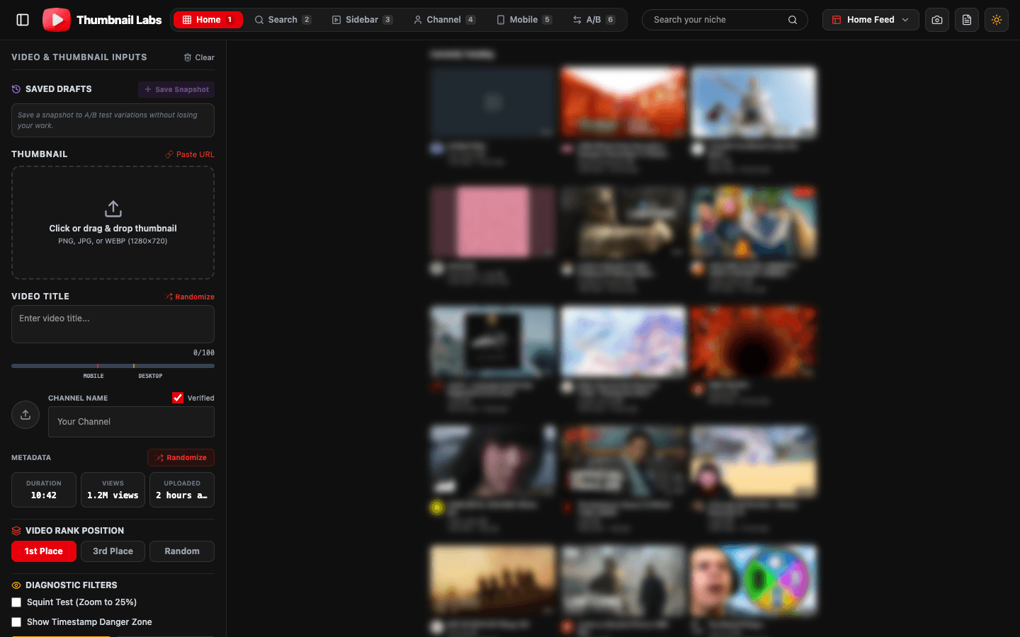
Thumbnail Labs includes a visual diagnostic suite (squint/blur, grayscale, colorblind simulation), AI-oriented CTR scoring signals (contrast, saturation, face detection), and 10+ YouTube preview modes so you are not judging art-board fantasies.
Pair squint tests with real niche context
A thumb can “pass” squint in isolation and still die next to louder niche peers.
After it passes blur:
1. Search your target keyword inside a live niche previewer.
2. Drop your thumb into the same feed row.
3. Ask: does your silhouette still win the row?
That second pass is where many “pretty” designs lose.
A simple pre-publish checklist
- ] 16:9 export, sharp enough for YouTube’s pipeline ([custom thumbnail specs)
- [ ] Squint/blur pass at feed size
- [ ] Grayscale pass
- [ ] Mobile layout pass
- [ ] Niche feed compare pass
- [ ] Title does not duplicate every on-thumb word
- [ ] First 15 seconds of video match the promise
FAQ
Is the squint test scientific proof of high CTR?
No. It is a hierarchy and legibility filter. It removes obvious failures fast. Final proof still comes from audience behavior and, when eligible, YouTube Studio A/B tests.
How much text survives a squint test?
Usually a short punch phrase. If you need a full sentence, put it in the title.
Should every niche use giant faces?
Not always (gaming UI, product-only, animation). You still need one dominant shape and strong contrast.
Conclusion
The YouTube thumbnail squint test is the cheapest CTR insurance you will ever run. If the story disappears when detail disappears, the feed will skip you. Fix scale, contrast, and text load, then confirm the design inside a real feed.
Try it now: Upload a draft to Thumbnail Labs, run squint/blur + grayscale, and preview mobile Home before you hit publish.